Monday, February 17, 2014

New Software!


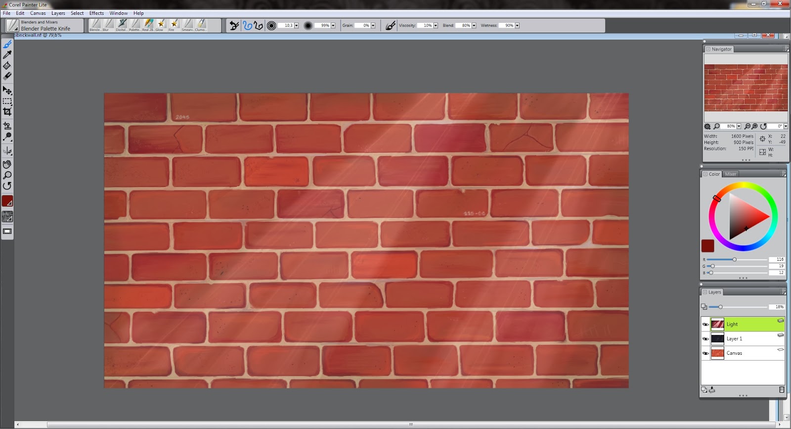
On Friday us people in Finland began on our annual 'Ski Holiday', which basically means a week off of school with lots and lots of skiing and ice skating either here in Finland or somewhere else where you've got a lot of snow to downhill ski. Now, last week my Painter X3 trial expired, so I wanted to get some work done before it would expire so that I wouldn't have anything unfinished for the next week or so because I'm waiting on my licensed version of the software to arrive.
 I had planned everything well for Monday and Tuesday to work on the Indian kid 'project' since I had two days left after Sunday to work on the Painter. I ensure you, I did work on it all day Monday and as I closed the program after a good day's work, little did I know that the 1 day I thought I had left and what the program had told me was indeed not true when I came home from my studies on Tuesday. So, I was left with little option to continue and I have to say I'm a bit skeptical about the Photoshop for painting pictures. Anyways, for the rest of the week I've been caught up in school work and this sort of 'Senior Prom' that was going on just a few days ago. Not that I attended, but it was quite hectic for awhile there. 

Anyway, yesterday afternoon I decided to download the Adobe Photoshop Elements, just to get a feel of what it is about and I didn't feel confident enough to download the full on trial version of the Photoshop for the time being. I'll get onto that later, all in all Elements is just a cut down version of the Photoshop just as Painter Lite was to Painter X3. 
For now, I'll just walk you through on what I did on Monday before my Painter expired:

To jog your memory once again, here is the work I was left off with last Sunday. 
Figure 1
Alright, so from here I had to bite the bullet and begin on the 'hairy' of the headdress. I started on this by darkening the bases of the hair and lightening the tips to show where the hair begins and ends and where the feathers enter. Here I use a larger brush because I am in no need of strong detail just yet. 

Figure 1.1
While I was getting into the fur on the headdress, I got extremely distracted as usual and I started putting detail into the headband of the headdress making it darker and giving it a more grainy look instead of a smooth one that it used to show. I also added quite a few wrinkles all around before I could find myself satisfied with the outcome. I used the Airbrush of size 4-5 and turned the opacity down to almost less than half just to gradually darken the color of the headband. I thought this would give the work more contrast and impact overall, I felt it was looking a little bland previously as you can see on the first picture. Below you can see my progress on the headdress more clearly. 

Figure 1.2
After being satisfied with the headband, I began concentrating on the fur again which I really did find quite challenging. It was very difficult making the fur look somewhat real and as it were floating in the air and honestly I'm still not quite sure if I've succeeded. However, after getting the base colors right I could begin on the smaller details and thus I decreased the size of my Airbrush to about 2-3 and began altering the shapes and directions of the hairs to bring them out a bit. I don't wish this part to bee overly detailed, this could take away from the overall composure. I still want the face and the feathers in front to be the main focal point. 

Figure 1.3
After a few hours of work I began to get frustrated on the immense amount of hairs I was supposed to be working on and I decided to distract myself again for a bit and I found some flaws around the picture which I tightened up around the face and added more contrast all around. The main point that caught my eye were the long 'beeds' that held the fur in place. They just seemed a bit too smooth for the picture, and so I added some grain by increasing the opacity and decreasing the size of my brush and I stared dabbing away with lighter and darker shades of grey which gave some texture to the beeds, which I thought helped the image quite a bit. (See difference between figures 1.2 and 1.3)

At this point, it was getting late and I needed to begin on my other duties so I managed to just about finish the fur on top of the child's head and let it go there, hoping to continue the next day and finish the rest of the fur running down his back. But as we know, this did not happen. 

Figure 1.4
And here is the overall result of all my hard work on Monday afternoon. Now, if you compare this outcome in Figure 1.4 and Figure 1, you can see quite a difference in contrast all in all; Figure 1.4 is much darker and detailed overall. Fortunately, I am expecting the arrival of the real deal version of Painter X3 tomorrow, so I'm hoping to get some work done then.

Now, I just downloaded the Photoshop Elements on Saturday and I have to confess, it did not do much for me. I feel as though it's too simple and I need a little challenge even though I'm sure it has plenty in it if I'd just dig in a little further. After fiddling around for a bit and checking out the brushes, templates and filters I opened the Indian Child onto the software. This is what I saw:


You may think that this looks fine here and wonder what in earth am I talking about but I am telling you if you zoom into this picture above you can see all the rough edges and pixels that you cannot see in Painter. I don't know about you but I like my edges smooth and dandy.. I had followed the rules correctly in my mind, I had saved the indiankid.rif (Painter) file as a psd (Photoshop) file and most certainly not as a .jpg file so this confuses me very much. I have read if you save your file as a .jpg you may lose the quality in your work as you duplicate it but I haven't read anything on this. Anyway, this was a big turn off for me in this software and I don't feel to comfortable continuing my work on this.

Anyway, all in all it is an easy software to use and great if you are a beginner as myself in this field of digital art but as it has already been said, this software is made for photo editing and not image creating as I prefer. I'm still going to continue and get familiar with this software as far as I can before I get the Painter X3 in my hands. Wow, I didn't think I could have squeezed a post from this but apparently it is possible!

Sunday, February 9, 2014

Indian kid: Part II

I'll just cut the meaningless chit chat and head right on to my last week's project. If you're not familiar with it, feel free to go back to the post right here -> http://whereisyour-mind.blogspot.fi/2014/02/an-indians-child.html

To rewind to the last post and get you up to speed, I'll just put the picture that I was left off with on the Painter. This is what I was left off with last Sunday working on the Indian Kid.


As you see, It's really in the middle of everything. I still have the feathers and the fur to touch up and add texture and detail to the entire image. Just to remind you, I'm not drawing off a picture, you know, as many people do with the whole digital art world. I've got another screen right next to me with the rough idea of what I am drawing; I just need that for reference to the Indian Headdress since I'm not too familiar with the looks of them in detail. After this, I'm still going to head on with the Digital Airbrush, but what I will change is the opacity and the size of my 'brush'. To add detail to the fur on top of the feathers, I begin by sizing down the brush to about 1.5 and setting the opacity of the brush to about 20-30%, depending on what shade I'm using. 

As I'm working on this picture, I've been mulling around whether I should add color to the image and I'm still yet to make a decision. What I was ultimately planning though was to add some color to a particular area in order to grab the attention of the observer, but I haven't decided what I want my focal point to be so I haven't headed onto add any color anywhere yet. Maybe I will do that as a final touch, perhaps make the star on the headdress shine, ensuring that it captivates the observer. 

I've actually had quite the hectic weekend and I haven't gotten much time until today afternoon to work on the Indian Kid. I guess it really does take me forever to finish anything! 


Anyway, I began working on the feathers and the fur (if you can notice from the picture above) around the kid's head and I discovered that it was actually a lot harder and more time consuming than I had thought. I sized down my brush even further to about 1.3 and pushed my opacity up to about 29%  in order to lift out the thin hairs that are being blown by the wind on the feathers. You can see this progress the best on the feather on the far left. Now, if we go ahead and compare the picture above and the picture I was left off last Sunday, you can see the added detail on the feathers, the don't look as 'sprayed' as they did previously. Additionally, I started adding detail on the face of the kid, by adding eyelashes and improving on my shadings and enhanced the lines above the eye. 


However, despite all my hard work, this is what I am left with now and I guess you can hardly see the progress I made but oh well! Maybe next time, I'm hoping to add some color by then.. 


From this you can see - at least I hope you can see - that I have tightened up my line work and added some more contrast to the feathers, especially the one in between the two spotted feathers, in order to make them distinct from each other. I do think you can see that now the fur looks more 'furry' than in the previous pictures and they float nicely around the child's face. I've also pretty much just added contrast everywhere around the picture - well, around the face - which helps me to envision the final work and begin working on the feathers above child's head. I am not looking forward to tackling that one..

Unfortunately, my trial round of Painter X3 is running out and I'm yet to order the real copy since it's very difficult to get one of those home/student versions here in Finland and the commercial copy costs around 400 euros which is quite a lot for my student budget. However, I have a few tricks up my sleeve to get that Painter and for the time being, I am going to download another trial version next week probably of Photoshop and get myself used to that until I get my Painter running. I'm a bit skeptical about Photoshop since I'm not a real photo editing enthusiast, I like to keep my pictures real without too much false 'beauty' put into them. I we will find out next week how it works out..

My apologies, this post is going to be a bit shorter than the usual since I've only been working on the fur and feathers this week and I've been too swamped to draw anything in my sketchbooks during school times (you know, during skips..). Next week I hope to at least get this done and begin on something new and exciting with the Photoshop. 

Sunday, February 2, 2014

An Indian's Child

Wow, its already February. I've got to get a move on on my New Year's resolutions. 

Now, before I start on my workings during the past week, I wanted to say that yes, I do remember I had started the Robo Man drawing last week and no, I will not be continuing it this week. Frankly, I did have every intention of doing so until I opened it on Painter and just couldn't get the mood for it. Sorry about that. However, this week I've been in a more down to earth mood and thus I have been drawing in my sketchbook during convenient moments at school and home whenever I got the hankering for some led. 

So this week I started on this, a portrait of 'Edward Sharpe' as he is performing in his alter ego, that certainly looks a lot like Jesus holding a microphone and indeed has been mistaken as Jesus several times. Maybe he is, who knows. A modernized one perhaps but you've got to be don't you in the 21st century. 


Anyway, Jesus or not, its not quite finished yet because I had to start on other things during the weekend and didn't find the time yet to finish. I will probably finish this doodle during school next week, if I'm lucky enough. Just to talk about something, I thought I would show you my tools for doing this, even though it is a extremely obvious statement. I like to use the 2B graphite pencil the most, don't know why but I feel as though it always does the job and you can see it has been used the most compared to the 2H and 8B. I haven't found the 2H pencil useful, unless I'm working on hair or something with great detail like that. 


My magic makers are my erasers and my smudge tool, ah I

 could not survive without them. These are what make your life so much easier when drawing with graphite pencils: if you use the grey eraser shown below, its perfect for lightening your colors to your liking without ruining your lines or erasing all your work. On the other hand, the more regular eraser that is also harder and thus, more powerful is great for erasing out detail from your darker surfaces and comes into equal need during your process, or at least my process.


To be honest, mostly for smudging I use my own fingers to do the job but of course, I'm a more get down to it person and I don't mind getting my hands a little dirty sometimes in the name of art. It's not for everyone and that is why we have these awesome little pencil-looking things called smudge tools.

Alright, now that that is all dealt and done with, I'm ready to go on to the next subject. Today I started on this project of an Native American child with a headdress on. After watching a documentary last night on Johnny Cash and his performance in one place or another, I saw these Native Americans in the audience listening to his songs and I just got this light bulb moment and I just had to forget everything else and start drawing. It actually does fit nicely along with the totem poles and the eagles that have featured in my past posts, and I've been eagerly working on it since 12 o'clock this morning.
 So, I just downloaded a picture on my phone of a child with a headdress and another one of a woman wearing another type of headdress and I sort of combined the two; I wish I could post the pictures here but I couldn't download them onto my computer since I downloaded the pictures onto my phone from We Heart It and getting the pictures off my phone onto the computer is too much of an hassle for the day.

Anyway, here is the 15 minute sketch I came up with as a guidance. I opened a layer on top of the canvas so that I could move or re-size the sketch if needed. 


After this, I started blocking in the colors by opening another layer under the sketch layer and turning the opacity to about 85-90%. I also set my sketch layer to Multiply, so that I don't lose any sketch lines. For the block, I use a Digital Airbrush that is a round brush without the point. Also, when blocking its important to use a large brush size, so that you won't worry about the details or waste too much time on refining shapes and ideas; the main point is to get the color values right. 


Here, I've blocked out pretty much all the colors I need and I've started on the background. As you can see, I haven't started on much detail and I've kept my color values fairly simple. I found this stage enjoyable, since you don't have to concentrate on getting the shapes or details correct yet, just get the values of dark and light correct and you're half way there. Because I've used the Digital Airbrush, my image looks quite hazy doesn't it? But this is the point: after refining my picture numerous time, hopefully I will achieve the look of haziness but not too much to make you squint your eyes in order to find some detail.
 At this point, I could choose to implement some alternative colors than just black and white in my picture, but I've made the decision to keep it simple and colorless. 

Now it is time to go into some more detail, not to quite all the way to the nitty gritty as you can see in the picture below. I've added a new layer, so that I can start fading away my sketch lines and finding a more specific shape to the facial characters and the headdress. 


You can see that I've started to reshape the ornaments on the headdress and find a general shape to the face and begin to fade away my sketch lines on a new layer. I've also started adding darker shades of gray to pop out the face of the child and bring more life to the whole atmosphere of the picture and you can see how it has gradually lost its haziness at parts of the image. Honestly, I'm quite frightened to begin on the feathers, since they always require so much attention and detail and frankly I'm not good on feathers, my patience just doesn't last that long. But as they say, practice makes best so I try not to complain too much. 

After this stage, I didn't get too far until I had to start on my weekly blog post right here so there's not much difference to the previous picture and the one below except the ornaments or whatever they are on the headdress. They took quite a while to do, believe it or not. 


 I'm actually pretty psyched to see what will come of this. Now, I can't waste too much time blogging since I've got to get back to work and finish this bad boy so that I have something to show next Sunday.. 

Sunday, January 26, 2014

A Discombobulated Sunday

Yes indeed...

As you can read and figure out from the title, this passing Sunday was a fairly discombobulated one. As some of you may know, the Australian Open was on today with the men's singles finals in the grand world of tennis.. So that was definitely a must watch, which took up about half of my day cheering on for the injured Rafael Nadal. Spoiler alert - he lost. Such a bummer  I was really rooting for that poor fella... I very much disliked Stan Wawrinka and his distasteful actions towards the umpire during the game. Phew... Anyway, this blog ain't about tennis so I'll just be done with that topic from now on, don't worry. The next tournament is in a few months so no more tennis talk until then.
 I did however utilize the rest of my Sunday staring at a empty 'canvas' on the computer screen after sort of finishing my Totem Pole exercise, which was pretty awesome indeed until I decided to do another of my old favorites on the real life paper which is the robot man that has featured in one of my previous canvases, if you remember the metallic one a few months ago or if you don't then feel free to go check it out I do think it is in one of the first posts I have done. 

Yes, to business. Just to remind you of where I was left off last Sunday, here it is. The cat is still in need of a face and overall animation as well as the bird head and a background is still boring..


After contemplating on this for awhile, I felt as though it was a bit too light and popped out too much to be an 'old' totem pole. This inspired the decision to add a new layer and set the opacity of the layer to more or less half of the full setting and add some darkness to it with a Digital Soft Pressure Air Brush or a Digital Soft Flat Airbrush depending on the texture that is needed. To demonstrate, I'll just show you the looks of this layer just on it's own.


As you can see, I've only selected a few spots to add some darkness or in case of the bird's head, lightness. I wanted the totem pole to have a rugged and messy feel to it but I just can't seem to master the techniques quite yet to do so. Anyway, after doing this if I'd feel like it, I could set the opacity higher in order to intensify the colors I just set on top of the color and detail layer or lower the opacity in order to bring out more of the original colors which will also brighten up the object. Any case, I thought the opacity I set was suitable for me so I continued to add detail on the lower detail layer and started on my background with the Soft Airbrushes, which worked somehow out I guess. 
I also decided to add a little bird on top of the wing of the totem pole - supposing to portray a crow... I didn't want to detail the little bird too much on the wing or in the back too much so that they wouldn't take up too much attention from the actual object as with the sky - which consequently is kinda blurred up on purpose and by the discovery of the Pressure Airbrush.  


So, here is my final piece.. Sort of, if you can really call it that. One of the perks which I read of also is that with digital art, it is difficult to know when you really are finished with your piece, because you really don't want to overdo it. Even though in my opinion after merging all the layers I've been working on it does feel like it's completed and no more editing is needed or possible. To reflect on my now finished piece and looking at it staring at me on this page, I feel as though the totem pole doesn't feel 'woody' enough and to be honest, a bit too shiny I really don't know how I managed to pull that off... But, as usual, I lost the patience to discover how to do it after countless painting overs and all that comes with it. I do believe it does put out the idea that I was going for if not in a perfect manner. 


Now, just for fun, I'm gonna set up the picture of my previous canvas before digitizing for comparing and contrasting. Looks pretty different huh, even with the bad lighting that I've got going on there. I do remember being quite frustrated with this totem pole too, the colors weren't cooperating just like in the one above. I've definitely got to revise my color eye. I do have to say, the one on the right is a lot more flat than the one above which is kinda funny, you can also see how much more I can edit the one above as compared to the real life totem pole drawing has a lot of mistakes that can't really be fixed anymore concerning shape etc. I do have to admit that making the canvas was a lot more fun anyway than doing it on the computer, like it really felt like something had been accomplished and could be put on top of my bookcase and never look at it again until someone pulls it out. Ha, almost exactly what will happen to that picture up there. 


Now that the Totem Pole was just finished, I was left off at square one again. What to draw? What indeed... Probably needless to say, I contemplated for a while on numerous things like life, death, school and whatnot. Then I just had put on some cool and inspirational music like Bob Dylan or Edward Sharpe & The Magnetic Zeros (you should definitely check out this band if you don't already know it in which case I admire your musical taste - amazing stuff) to get me back into the groove. It did work and I thought I'd keep going on something that is pretty much familiar to me and going on the same track of building characters and getting them onto my computer and into my library of digital pictures. I dug through my various sketchbooks and found my old friend, the 'Robo Man' (he is lacking a better name for the moment) and I thought he would be perfect to draw into my library. 
I didn't get too far due to running out of time because I had to start on this blog right here on time. Anyway, I managed to sketch out the pose and face etc which is pretty good and productive for today which I can build on for the rest of the week when I get a free moment. 


I thought it would be pretty cool to attempt to form some kind of a metallic texture to Robo Man that was more difficult to achieve on the real life canvas due to a lack of shades of gray - ahem, not an excuse at all.. Anywhoozles, to wrap things up neatly, I'm starting to think that this will be a interesting project for me to tackle and I'm looking forward to showing ya's the results next week if all goes well.

Sunday, January 19, 2014

The Totem Pole

Post time again. 

It's really getting cold outside by now over here, it's around -15 to -20 degrees Celsius and needless to say, almost too cold to start any canvas painting on the balcony. So, I'm going to take a break from the canvas projects for a bit until I get the strength to fight the coldness and pursue a new project. This gives me a good opportunity to sit on my ass and learn to master the crafts of digital art! My trial version of the Painter Lite just expired and I still haven't ordered my Painter X3 or 12 yet, so I had to download the trial version of the Painter X3 (the newest version). You can see the interface below if you are interested.

I wasn't really sure what to draw yesterday, so I thought I would take something familiar and what I usually enjoy to draw on paper. So I ended up with a totem pole which seemed to be a good choice at the time. A great thing about the Painter X3 is that it has all types of pencils (2H, 2B, 6B etc.) which is great for sketching and doodling before actually beginning your 'painting'. The Painter Lite did not have this - well, it did, but it was quite annoying to draw with meaning that it wasn't meant for actual sketching - which I didn't particularly value. Also, the real deal Painter has the lasso tool, the magic wand and a massive amount of choice in brushes (I don't find that as necessary, I usually just stick with a few key brushes like the Digital Airbrush or the Acrylics). Anyway, this is what I came up with with a quick sketch and with the beginning of coloring. 

I used my old totem pole as an example, just to see how well I could imitate it digitally taking a few liberties here and there. With the sketch I used the 2B Pencil, which worked out great for sketching and I managed to get nice fine lines which I couldn't find on the Painter Lite. I also darkened my background 'paper' color to a light grey, its just easier on the eyes.


After sketching my figure, I added a new layer and called it 'color' and began blocking in my colors and filling in the finer aspects with an Opaque Detail Brush under the Acrylics section. Also, another cool thing in X3 is that you can choose different qualities for you layer, for example, I used a gel layer which showed me the outlines of my pencil sketch (as you can see on the picture above) which turned out to be pretty useful after all. 

 Even though I had started on my colors and found a general form for my eagle, I still wasn't too satisfied with the look of the whole thing, so I added a new layer again and started modifying the shape of the blocks and what I came up with was quite different from the original. 


Here, I've started on my slightly finer details and beginning to find the form and shade I'm looking for in my totem pole.  I decided to get rid of the cat's face for now and find a new look for it that wouldn't be as cat-like and more native or something like that.. More simplistic and not 'anime' type, you know. I'm still contemplating on the whole idea, I never did get too satisfied with the coloring of my totem poles... But I'm working on it. 

Another thing I thought was cool when I wen't to hide my 'color' layer for one reason or another and I came across this here. 


I don't know why, but I found this picture or.. whatever it is, pretty cool and interesting. I hadn't even known it myself but there it was. I particularly liked the wing, don't know why. Anyway I thought I would share it since those are the little things that give you ideas to greater things. Experimenting is key to success...right?

Alright, unfortunately after this I got a bit sidetracked due to the Australian Open going on right now and you know, all that other stuff so I ended up procrastinating and not achieving much. However, I did kinda finish the other wing and added some depth to the 'torso'. Just to demonstrate where I was left off I'll add a picture below for you to see. Sadly, it's too late for me to delay my post so I won't be able to show you the final outcome. I still have the background and detail left... Check it out next week though!

Here we go. I'm too frightened to add the eyes because I can't seem to get them right by any chance. I will get there, I will... If you notice up there in the left  corner you can see that I am using the Blender Palette Knife to mix the colors together to achieve a more smooth look.

Anyway, that's all for now, get back to work.

Sunday, January 12, 2014

Bob's Touch

Sunday again...

This passing week was the 'get back to school' week, so I'm running short of time again and haven't been able to do too much artsy stuff. Actually, not that I've been studying TOO much anyway but I have been pursuing my long lost wish that is finally coming true. I am getting a passport about six months earlier than I should have so I am leaving by the summer to reunite with my family in the United States, which I find pretty damn awesome. So from now on I will be quite busy with plans and school unfortunately, but of course I will make some time for art, I just have to. Anyway, during some boring skips in between lessons during school, I began drawing a quick sketch on a side profile of Bob Dylan and well.. It just kind of escalated from there and ended up with this drawing shown below. 


I would love to show you the real picture, but unfortunately I can't find it on the image search because I had used one of my old pictures on the phone as a reference to draw. I haven't really enjoyed drawing with graphite pencils before, but this time it was more effortless and I have no clue what so ever why that is. This is in my sketchbook which is A4 sized, I should have drawn it on a bigger surface but it is difficult to bring something big like that to school and drag it around for 8 hours. This took me about 3-4 hours to draw, which isn't too bad I guess considering how much time these things usually take me. I have been known to work on one 'realistic' charcoal or graphite drawing non-stop for about a week, and then just trashing it because it just wasn't going to work out. However, I did find the hair very difficult to do... I procrastinated it 'till the last minute and still I was reluctant to begin. I did manage to start, but way later when I got home and I worked on that damn hair for at least two hours straight. 

Anywhoozles, to continue last weeks project on the Painter Lite. This is where I was left off just to jog your memory, if you feel like you need more memory jogging, feel free to go and click the previous post and get yourself up to speed. 


So, the next job after this was to get the coloring in place. I was playing around with quite a few colors only because of the sheer enormity of choice, I've got to tell you, it wasn't easy. Well, after awhile I did manage to choose colors of metallic grey, a minty green and a nice warm blue color. After coloring my work in I did feel as though my letters weren't really matching but me being lazy I just decided to go with the flow and forget about it for now.
 If you check out the Layers section on the picture above, on the lower right corner, you can see how many layers I got going on for me and the oddest thing I found out was that it was actually slowing down my computer.. My brush strokes started to have a lag and froze most of the time and as I was getting more and more frustrated about it thinking that there was something wrong with the wireless connection on my tablet or that my computer was just running out of space. Well, after plugging in my tablet  to  my computer and cursing the machine and the software, I just decided to finish the picture, merge the layers together  and then just be done with it for good. Well, of course after I finished merging the layers the whole program worked like a dream and I was sitting there like a complete idiot. Computers and software are just not my thing obviously.. Oh well, a lesson learnt there. 
Anyway, here is the just about finished picture  in all its simplicity. 


 You can see how the shadings on the letters are quite simplistic and I haven't done any tricks with the coloring but I figured this will just be a testing experience and maybe I still need a bit more practice with simpler drawing before starting on with something like graffiti and the street style that I usually do. It doesn't look anything like I had envisioned in my head but I do think it taught me something....Maybe. 

That's all for now, tune in next week for more. 

Sunday, January 5, 2014

First of 2014

Hey y'all, 

Another year come and gone and another year to make new promises and improvements to yourself and others that usually turn out to be in vain. Ha ha. Anyways, I've been busy learning how to utilize the Painter software and reading up on my books on digital art. Too bad that most of them just talk about using Photoshop to apply some different filter like it's something too difficult to do for the average Joe. In my opinion, making your photograph look like a painting by slapping on some "magic wand" brush strokes is just another form of cheating and then calling yourself "artistic".. But that is just my opinion of course and I'm not the one speaking of experience, which actually brings me to a great line by a band called the Avett Brothers. It goes something like this; "Ain't it like most people, I'm no different, we love to talk on things we don't know about ". So that's that then, you make your own opinions on things.

Alright, time for business. During the last week I was still just getting used to all the different brushes and effects that Painter contains, so I decided to just begin with a simple idea: I started off by just drawing a tree and building it up adding shadows around as I went.

On this picture I think I used the basic bristle oils to achieve a painterly look and I used a palette blender knife to blend the colors together. At this point I'm still not too comfortable with the graphics tablet and the whole setup so the picture doesn't look to great or at least the composition is seriously off. After doing this I actually did get a better feel and started to feel more used to the whole concept and maybe soon I could even start doing some graffiti and other works more in my comfort zone. Even though, let it be known, getting out of your comfort zone is not a bad thing at all. I try my best to get out of it.

Thus, after ahem.. "finishing" the tree and the sketchy background, I thought I could finally start on something that I've never had the colors for on the real canvases (mainly because I'm too lazy to go into the city and buy spray paints), so this was actually a great opportunity to do it: a brick wall. It was a good experience just to focus on small details for a day or two and get my brain used to the fact that I'm drawing virtually and you know, getting the whole moving around issue together and tilting the picture to get straight lines etc. Also, me being too intimidated to start anything real quite yet, I stretched the brick wall project out as far as I could trying to think what I will put on it that has some good taste. The details and colors were fairly difficult and getting the brushes to behave like they do on my regular canvases. 

And after about two days of work, this is the outcome. Not too detailed but enough to get the picture. Anyway, it is the background and shouldn't draw too much attention from the actual piece.

After finishing the ground work on the piece, I felt as though it needed a certain 'notorious' feeling, so I added a layer of black on top of the brick wall with a capacity of 16% just to darken the picture a hint. After doing this I got a great idea that maybe the picture should have a few light spells that would highlight the graffiti that was to come and give another dimension to the picture, another thing I would never be able to do on my regular pieces on canvas. This layer I had on opacity of 18%, basically just going by feel not consistent numbers. I also added in some red in with the 'light' layer to add some character. 

Even though I had just added a layer of darkness and a few light spells, I still didn't feel like it did the trick and the picture still didn't feel quite enough notorious. So, I just duplicated the layer and added some lighter lines on to the spells so that the would pop up and seem more realistic as opposed to the previous one. 


 Now that is more like it! I can feel the darkness and haze falling upon the brick wall and the light spells giving some dimension to the picture as a whole. 

After being satisfied with the outcome of the background, I opened a new sheet and started planning my graffiti that I'll implement onto the brick wall and the outcome was something like this. I still find it difficult to draw with the pencils, because of the tilt function on the pen which easily makes the marks too fat and in order to keep the tip small, you have to keep the pen at a 90 degree angle. This I find quite challenging, but I guess you get used to it or then I will just have to find some other brush to work with. In order to make the drawing process on a white sheet easier on the eyes, I set the color of the paper to a light shade of grey. It helps a lot, especially if you are working on it for long periods of time.. 


 Being finished with my original sketch, I had to get this on my brick wall and start drawing the outlines. This is where I ran into complications and wasted a lot of my time trying to figure it out. Turns out that after outlining our graffiti onto the background, there is no way to re-size it. I needed this because I had made my graffiti too small for my taste and I wanted to enlarge it just by a little bit and I could not find a way to do this. Oh well, after about 2 hours I managed to get my outline onto the picture, and below is the outcome.

 And here we go, this is the point that I am at now ready to start with my color scheme. Not too much trouble, but enough to make me frustrated enough to lay off of the project for a while. 

Tune in next week for the final results...