Sunday, November 17, 2013

The Hippie Project - Take II

Hiya folks!

Top of the Sunday to ya's.. I have been extra busy this week with school work, for next week is an important week, well, you may not know but all us so-called 'Lukio' kids here in Finland are extremely aware of - the test-week. This is what all the Finnish kids in upper-secondary school dread every few months or so. Essentially it is seven days of brain wrecking tests, just tests. It is not fun I guarantee you. Anyways, enough about my school issues. I managed to fit a few hours of art in during this weekend and I used all those precious hours for my Native American Project. I am happy to say it is not a blue sky with two clouds anymore! I do have to admit, I've only used about 2-3 hours on the project this week, so everything is still pretty much a rough idea and I think it will change quite a bit by next week's post.

So this is were I was left off last Sunday.
A pretty little blue sky with a few clouds here and there bringing the mood up, now of course I wished I would've made the whites darker and more wide spread because I used more space for my graffiti part than what I had estimated but hey, it's fixable. I will just have to doctor it up a bit with the spray again in the end and it will turn out just fine. Hopefully. I forgot to take pictures from when I sketched the whole picture on, but basically I just use a neon yellow marker for that part, as you can see in the picture below with the eagle.

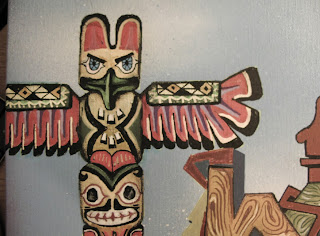
Aaand this is what I started with this morning. As you can see, I had just gotten started with the graffiti and the totem pole is poorly done. A lot has got to be done! I got sick of the totem pole yesterday and today I just wanted to do something else so I started coloring in the letters REZ.


I got this great idea a few days ago to make the letters as they were planks of wood which, don't mind me saying, looks pretty good against the blue sky and gives a cool texture to the whole canvas. I figured that the whole shebang can't be one big plank of wood so I thought what better hippie/hipster color than burgundy. Tacky, I know! What can I do, it does fit into the color scheme. After coloring in the letters and giving them the wood texture, I started thinking about the shadows and I still cannot think about a good color to fit the theme. Black would work but it is just too boring and I feel like I have over-used it for awhile now.

 Concerning the totem pole, I have this doubt in my mind that it will not blend with the letters and I have to figure out a way to buddy them up. I might add in some clouds to sort of haze them together, maybe that will do the job. I just love the wings on totem poles, and I wanted to give mine a bit of a hippie twist on it, hence the squares and patterns. The original version had a simple triangle on it, I just felt like it would not do it for me this time. After working on the totem pole for about two evenings, I felt like I had personalized it too much, and it didn't feel so real anymore so I had to go back to the picture and get more influence out of it. I didn't change the wings but everything else had a minor makeover. The pictures below don't have such great lighting because it's getting dark so my apologies. I had to naturalize the totem pole a bit after looking at the original picture and I do believe it is blending in better now, especially looking at the pictures now. Could be the lighting though, I am not quite sure yet.

Alright, enough about totems. Here we go, the REZ. Sorry about the lighting again in the pictures, November evenings are a bitch... But yes, I really do like the texture in this piece. The colors really seem to blend in, I haven't tried the mix before and this one just came with instinct. I barely even knew I had a burgundy-colored marker. Oops. The only thing missing is the cloud action I wanted in the background, but I shall fix it later. This piece is great in that I could let my hippie character out and I didn't have to listen to Matlock, 2Pac or Outkast to get into the graffiti-mood, which I usually have to. Not saying it's a bad thing or anything, just a nice change.


Here's a bit more on the texture, can you feeeeel the softness?! Oh right, the shadows. I'm still wondering about that one. Ideally, I will have a nice little light bulb moment which will give me just the right answer I was waiting for. We'll see...


Aaand, this is where I am now. I am seriously dreading on starting the eagle, drawing birds was never my strongest quality. However, I have got to start someday - leaving it like this will just drive me crazy sooner or later. I really did I would have this piece finished by now, don't blame me blame IB. Next week I may not be able to post anything because I have tests all week so it could very well that the next time I'll be here it's going to be.... THE FIRST OF DECEMBER! Which is also when you can officially start listening to Christmas music and start your shopping sprees in jolly spirits.

That is all for now, the T is signing off.

Sunday, November 10, 2013

The Hippie-Project

Hey-ya people!

  What is up?! Alright, this weekend I have been busy with a lot of things, but mainly with the fairly new hippie-native project - I really should come up with a sufficient name for it but hey, I got better things to do with my time. I've only finished the background today since it's been a rainy, cold, windy, sunny... Eh, frankly I'm not sure, the weather just cannot make it's mind up today in good old Finland. That's November for ya. However, I have to wait forever for the canvas to dry enough so that I can work on it. Actually, I just finished right now and the piece is sitting outside on the balcony all alone waiting for my magic touch. Maybe, just  maybe in a few hours I'll be able to work on it, but you guys will just have to wait 'till next week, my apologies. Today's key word will be patience, patience, patience... 

   So, today I started early in the afternoon by building my canvas from S-C-R-A-T-C-H, not an easy job for one person. Long story short, I had to get some help for the stretching and stapling. My canvas frames may not be the most beautiful ones you have ever seen but I can say from experience that it is a sensational feeling when you look at your finished canvas knowing that you have made the entire thing with your own two hands. Really. 

Anyways, to refresh your mind, here is my original plan for the canvas:

And to begin with the real deal, I start with my canvas roll, figure out the dimension for my work and add about 8cm to the original dimensions, so that I have enough canvas to wrap around the wood pieces.


 My piece came out to be 55x40cm (63x48 with the extra). Make sure that your canvas piece is squared, wobbly lines will not work. Exact measures and straight lines are key to building a canvas. I may not be the best person to tell you how to build a canvas, frankly I haven't googled it or anything but you are welcome to tell me what I am really supposed to do, I just use the good old common sense.  


Now, I have cut four pieces of wood for myself, all ready to be glued and stapled together. I've got 2 x 55 cm and 2 x 40 cm wood blocks to do the job. After finishing the frame, I usually let it sit for a few hours and keep myself busy with one thing or another. When the glue is dry, I make sure the dimensions work with my canvas before cutting it out from the roll. Then I just stretch the canvas onto the frame and staple it together and ta-da! A finished canvas ready for some serious action. I make my way to the balcony and start working.  

 Here we go, at the balcony and ready to rumble, a piece of cardboard under the canvas so that I don't ruin the floor with some pretty colors. 
My color-scheme is quite simple this time, I don't want to draw too much attention to the background, so it will just be a blue sky with some hazy white clouds, I might throw in some purple or a darker blue to bring out some depth.


   As I said, it is all about simple colors. A background that has a certain calmness to it, the blue color isn't as dark as it is in the picture for it was quite dark outside and the inside light just won't do this time. I did add some purple, but I faded it out just enough to just have a little glimpse of it here and there.
   You can see that the canvas is a bit wrinkled, the stretching doesn't always come out perfect but hey, I'm looking at it right now and honestly, I cannot see a wrinkle and it looks just like the 'better' one you buy from the shop next store. What can I say, I'm satisfied.


Alright, now that we are done with the background, I wanted to let you in on my color-schemes for the actual 'fine' work. I usually change them around during the process, but I can give a vague main idea now.

I've been doodling these totem poles all last week, thinking of the perfect one for my canvas, and I'm down to two. I like the one on the left more, but the one on the right is more traditional to the picture that I showed ya's last week. Oh well, I will figure it out at some point. However, the color scheme will be down to earth, as the whole piece will be. I want to preserve pretty much the same colors as on the original totem pole with, of course, a playful twist so that it will jump out of the canvas as it would against a clear, blue sky on a warm sunny day. Ah, I miss summer. 
As for the eagle, the basic colors will suffice. I'm sure I don't need to tell you what they are. I won't make the eagle as detailed as it is in the picture, so I won't have to go buy a wide range of different browns and yellows etc. I still want to keep the surreal feeling that graffiti has, which is the great beauty of it. 


The graffiti itself, "REZ", will be a natural mix of colors, I think I will go for a wood-like texture, that'll mingle with the eagle and the totem pole. The picture above gives a rough idea for what I am going for. 

And to conclude, this will be the all in all color-scheme. Quite a mix, huh. Right now I can't see them working but I guess we will have to see next week what went down. I don't want to speculate too much and ruin the fun of playing around with the colors and finding that golden mix that we all wish for. 

Phew, apparently I do have a lot to say, who'd a thought. Anyways, that is all for now, stay tuned at least 'till next week and you will witness the grand finish of my first-ever hippie canvas. I must say I do have a good feeling about this one. 

Sunday, November 3, 2013

Post-Halloween

Happy Late Halloween peeps!

This week I started on a new design for my next canvas, woo-hoo! I got some time for myself this weekend and I just went for it. My theme for this new canvas is a sort of Native American thing, with totem poles and eagles and maybe a nice Aztec graffiti in the middle. I started the graffiti part yesterday not knowing it would become anything like it is now. I was just doodling about a hippie-type graffiti...thing and just trying something new, but today I was looking at it and I just had this light bulb moment that hey, this thing HAS GOT TO have a totem pole next to it- and so I found my inspiration. And here it is:


As you can see, I haven't filled in the background yet like the graffiti, since I've just been sketching it for the past few hours and I realized that I was running out of time to write this weekly blog post. First I was going to plot the totem behind the letters, but I had some expert advice which got me to change my mind to just have it hanging there next to the letters. Since the totem was on the left, I needed something to balance out the piece and what could be better to keep company to my lonely totem than a big old eagle! It's a work in progress, I still have to tweak some minor aspects. 


 It's just the basic "REZ" again, I want to keep working it until I find perfection or until I just get bored to death by it. I haven't been using this for long, maybe for a few months now. I've tried to achieve this hippie, folksy look that would bring a good old retro feeling to this piece, just to balance out the last cold, metallic piece. I have trouble with drawing smooth lines and roundish letters, somehow I can't find a way to make them pretty. Other people do a great job with it, I just don't have the patience. I believe sharp lines and shapes are what make graffiti unique. I have included a few round shapes, to even out some sharp edges that needed softening. 
I couldn't remember what a totem pole looked like in real life, so I had to google it. I love these things: the faces, expressions, the detail - everything! The art that goes into it is just magnificent and beautiful, every totem has its own story. Anyways, I used this one as a model for my piece, I wanted something authentic, not just what I made up in my head, even though that would have probably been better. Maybe next time!

Here is the eagle that I am using as a guide. Mine will be a simplified version, of course. I think my background will also be a beautiful blue like this picture has, it won't take too much attention but it will bring out the other colors nicely - hopefully. 

After the planning, I have to start making my canvas which includes  a lot of measuring, sawing and gluing.  Next week I will be ready to go. Yey!


Oh and have you seen my artist's studio?

-The balcony.

It's cool, it's cool.. As you can see I've got no space and during the winter it really can be a pain. But for art I will suffer!


To conclude this weeks post, I want to leave you guys with this great line that has stuck to my head for good.


  Great right? I find this so true, even when I look at my very artistically talented and gifted friends, who find the smallest errors in their works and fall in to a funk because of it. A true artist will keep going until they find their perfection. It's truly like trying to find your inner peace or zen - almost impossible. Remember the 10,000 hours friends! Great artists aren't great because they were born great, they are great because of years and years of passion and practice. 

'Till next week then!