Hey y'all,
Another year come and gone and another year to make new promises and improvements to yourself and others that usually turn out to be in vain. Ha ha. Anyways, I've been busy learning how to utilize the Painter software and reading up on my books on digital art. Too bad that most of them just talk about using Photoshop to apply some different filter like it's something too difficult to do for the average Joe. In my opinion, making your photograph look like a painting by slapping on some "magic wand" brush strokes is just another form of cheating and then calling yourself "artistic".. But that is just my opinion of course and I'm not the one speaking of experience, which actually brings me to a great line by a band called the Avett Brothers. It goes something like this; "Ain't it like most people, I'm no different, we love to talk on things we don't know about ". So that's that then, you make your own opinions on things.
Alright, time for business. During the last week I was still just getting used to all the different brushes and effects that Painter contains, so I decided to just begin with a simple idea: I started off by just drawing a tree and building it up adding shadows around as I went.

On this picture I think I used the basic bristle oils to achieve a painterly look and I used a palette blender knife to blend the colors together. At this point I'm still not too comfortable with the graphics tablet and the whole setup so the picture doesn't look to great or at least the composition is seriously off. After doing this I actually did get a better feel and started to feel more used to the whole concept and maybe soon I could even start doing some graffiti and other works more in my comfort zone. Even though, let it be known, getting out of your comfort zone is not a bad thing at all. I try my best to get out of it.
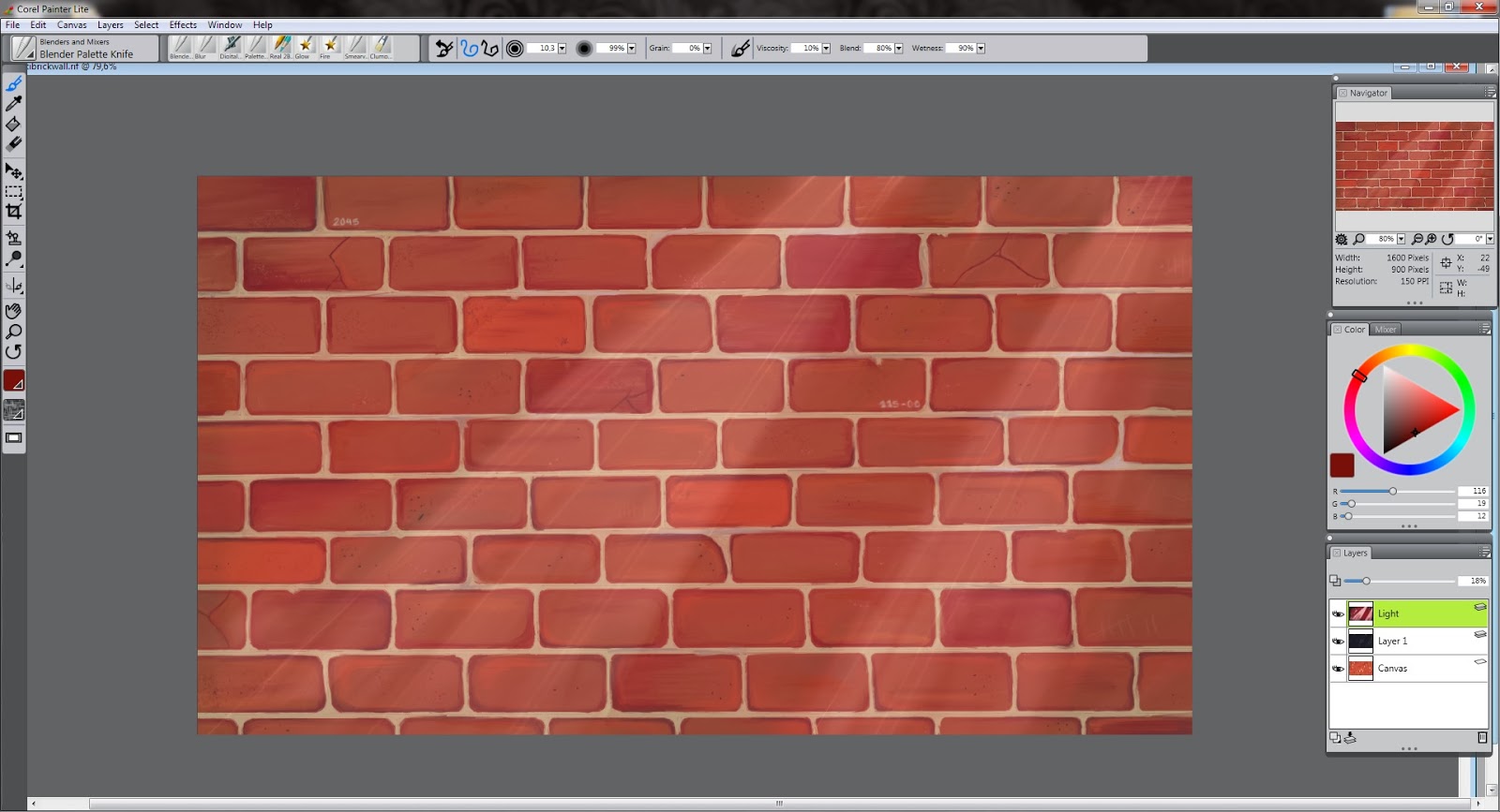
Thus, after ahem.. "finishing" the tree and the sketchy background, I thought I could finally start on something that I've never had the colors for on the real canvases (mainly because I'm too lazy to go into the city and buy spray paints), so this was actually a great opportunity to do it: a brick wall. It was a good experience just to focus on small details for a day or two and get my brain used to the fact that I'm drawing virtually and you know, getting the whole moving around issue together and tilting the picture to get straight lines etc. Also, me being too intimidated to start anything real quite yet, I stretched the brick wall project out as far as I could trying to think what I will put on it that has some good taste. The details and colors were fairly difficult and getting the brushes to behave like they do on my regular canvases.

And after about two days of work, this is the outcome. Not too detailed but enough to get the picture. Anyway, it is the background and shouldn't draw too much attention from the actual piece.
After finishing the ground work on the piece, I felt as though it needed a certain 'notorious' feeling, so I added a layer of black on top of the brick wall with a capacity of 16% just to darken the picture a hint. After doing this I got a great idea that maybe the picture should have a few light spells that would highlight the graffiti that was to come and give another dimension to the picture, another thing I would never be able to do on my regular pieces on canvas. This layer I had on opacity of 18%, basically just going by feel not consistent numbers. I also added in some red in with the 'light' layer to add some character.
Even though I had just added a layer of darkness and a few light spells, I still didn't feel like it did the trick and the picture still didn't feel quite enough notorious. So, I just duplicated the layer and added some lighter lines on to the spells so that the would pop up and seem more realistic as opposed to the previous one.

Now that is more like it! I can feel the darkness and haze falling upon the brick wall and the light spells giving some dimension to the picture as a whole.
After being satisfied with the outcome of the background, I opened a new sheet and started planning my graffiti that I'll implement onto the brick wall and the outcome was something like this. I still find it difficult to draw with the pencils, because of the tilt function on the pen which easily makes the marks too fat and in order to keep the tip small, you have to keep the pen at a 90 degree angle. This I find quite challenging, but I guess you get used to it or then I will just have to find some other brush to work with. In order to make the drawing process on a white sheet easier on the eyes, I set the color of the paper to a light shade of grey. It helps a lot, especially if you are working on it for long periods of time..

 Being finished with my original sketch, I had to get this on my brick wall and start drawing the outlines. This is where I ran into complications and wasted a lot of my time trying to figure it out. Turns out that after outlining our graffiti onto the background, there is no way to re-size it. I needed this because I had made my graffiti too small for my taste and I wanted to enlarge it just by a little bit and I could not find a way to do this. Oh well, after about 2 hours I managed to get my outline onto the picture, and below is the outcome.
And here we go, this is the point that I am at now ready to start with my color scheme. Not too much trouble, but enough to make me frustrated enough to lay off of the project for a while.
Tune in next week for the final results...
No comments:
Post a Comment