Sunday, January 19, 2014

The Totem Pole

Post time again. 

It's really getting cold outside by now over here, it's around -15 to -20 degrees Celsius and needless to say, almost too cold to start any canvas painting on the balcony. So, I'm going to take a break from the canvas projects for a bit until I get the strength to fight the coldness and pursue a new project. This gives me a good opportunity to sit on my ass and learn to master the crafts of digital art! My trial version of the Painter Lite just expired and I still haven't ordered my Painter X3 or 12 yet, so I had to download the trial version of the Painter X3 (the newest version). You can see the interface below if you are interested.

I wasn't really sure what to draw yesterday, so I thought I would take something familiar and what I usually enjoy to draw on paper. So I ended up with a totem pole which seemed to be a good choice at the time. A great thing about the Painter X3 is that it has all types of pencils (2H, 2B, 6B etc.) which is great for sketching and doodling before actually beginning your 'painting'. The Painter Lite did not have this - well, it did, but it was quite annoying to draw with meaning that it wasn't meant for actual sketching - which I didn't particularly value. Also, the real deal Painter has the lasso tool, the magic wand and a massive amount of choice in brushes (I don't find that as necessary, I usually just stick with a few key brushes like the Digital Airbrush or the Acrylics). Anyway, this is what I came up with with a quick sketch and with the beginning of coloring. 

I used my old totem pole as an example, just to see how well I could imitate it digitally taking a few liberties here and there. With the sketch I used the 2B Pencil, which worked out great for sketching and I managed to get nice fine lines which I couldn't find on the Painter Lite. I also darkened my background 'paper' color to a light grey, its just easier on the eyes.


After sketching my figure, I added a new layer and called it 'color' and began blocking in my colors and filling in the finer aspects with an Opaque Detail Brush under the Acrylics section. Also, another cool thing in X3 is that you can choose different qualities for you layer, for example, I used a gel layer which showed me the outlines of my pencil sketch (as you can see on the picture above) which turned out to be pretty useful after all. 

 Even though I had started on my colors and found a general form for my eagle, I still wasn't too satisfied with the look of the whole thing, so I added a new layer again and started modifying the shape of the blocks and what I came up with was quite different from the original. 


Here, I've started on my slightly finer details and beginning to find the form and shade I'm looking for in my totem pole.  I decided to get rid of the cat's face for now and find a new look for it that wouldn't be as cat-like and more native or something like that.. More simplistic and not 'anime' type, you know. I'm still contemplating on the whole idea, I never did get too satisfied with the coloring of my totem poles... But I'm working on it. 

Another thing I thought was cool when I wen't to hide my 'color' layer for one reason or another and I came across this here. 


I don't know why, but I found this picture or.. whatever it is, pretty cool and interesting. I hadn't even known it myself but there it was. I particularly liked the wing, don't know why. Anyway I thought I would share it since those are the little things that give you ideas to greater things. Experimenting is key to success...right?

Alright, unfortunately after this I got a bit sidetracked due to the Australian Open going on right now and you know, all that other stuff so I ended up procrastinating and not achieving much. However, I did kinda finish the other wing and added some depth to the 'torso'. Just to demonstrate where I was left off I'll add a picture below for you to see. Sadly, it's too late for me to delay my post so I won't be able to show you the final outcome. I still have the background and detail left... Check it out next week though!

Here we go. I'm too frightened to add the eyes because I can't seem to get them right by any chance. I will get there, I will... If you notice up there in the left  corner you can see that I am using the Blender Palette Knife to mix the colors together to achieve a more smooth look.

Anyway, that's all for now, get back to work.

Sunday, January 12, 2014

Bob's Touch

Sunday again...

This passing week was the 'get back to school' week, so I'm running short of time again and haven't been able to do too much artsy stuff. Actually, not that I've been studying TOO much anyway but I have been pursuing my long lost wish that is finally coming true. I am getting a passport about six months earlier than I should have so I am leaving by the summer to reunite with my family in the United States, which I find pretty damn awesome. So from now on I will be quite busy with plans and school unfortunately, but of course I will make some time for art, I just have to. Anyway, during some boring skips in between lessons during school, I began drawing a quick sketch on a side profile of Bob Dylan and well.. It just kind of escalated from there and ended up with this drawing shown below. 


I would love to show you the real picture, but unfortunately I can't find it on the image search because I had used one of my old pictures on the phone as a reference to draw. I haven't really enjoyed drawing with graphite pencils before, but this time it was more effortless and I have no clue what so ever why that is. This is in my sketchbook which is A4 sized, I should have drawn it on a bigger surface but it is difficult to bring something big like that to school and drag it around for 8 hours. This took me about 3-4 hours to draw, which isn't too bad I guess considering how much time these things usually take me. I have been known to work on one 'realistic' charcoal or graphite drawing non-stop for about a week, and then just trashing it because it just wasn't going to work out. However, I did find the hair very difficult to do... I procrastinated it 'till the last minute and still I was reluctant to begin. I did manage to start, but way later when I got home and I worked on that damn hair for at least two hours straight. 

Anywhoozles, to continue last weeks project on the Painter Lite. This is where I was left off just to jog your memory, if you feel like you need more memory jogging, feel free to go and click the previous post and get yourself up to speed. 


So, the next job after this was to get the coloring in place. I was playing around with quite a few colors only because of the sheer enormity of choice, I've got to tell you, it wasn't easy. Well, after awhile I did manage to choose colors of metallic grey, a minty green and a nice warm blue color. After coloring my work in I did feel as though my letters weren't really matching but me being lazy I just decided to go with the flow and forget about it for now.
 If you check out the Layers section on the picture above, on the lower right corner, you can see how many layers I got going on for me and the oddest thing I found out was that it was actually slowing down my computer.. My brush strokes started to have a lag and froze most of the time and as I was getting more and more frustrated about it thinking that there was something wrong with the wireless connection on my tablet or that my computer was just running out of space. Well, after plugging in my tablet  to  my computer and cursing the machine and the software, I just decided to finish the picture, merge the layers together  and then just be done with it for good. Well, of course after I finished merging the layers the whole program worked like a dream and I was sitting there like a complete idiot. Computers and software are just not my thing obviously.. Oh well, a lesson learnt there. 
Anyway, here is the just about finished picture  in all its simplicity. 


 You can see how the shadings on the letters are quite simplistic and I haven't done any tricks with the coloring but I figured this will just be a testing experience and maybe I still need a bit more practice with simpler drawing before starting on with something like graffiti and the street style that I usually do. It doesn't look anything like I had envisioned in my head but I do think it taught me something....Maybe. 

That's all for now, tune in next week for more. 

Sunday, January 5, 2014

First of 2014

Hey y'all, 

Another year come and gone and another year to make new promises and improvements to yourself and others that usually turn out to be in vain. Ha ha. Anyways, I've been busy learning how to utilize the Painter software and reading up on my books on digital art. Too bad that most of them just talk about using Photoshop to apply some different filter like it's something too difficult to do for the average Joe. In my opinion, making your photograph look like a painting by slapping on some "magic wand" brush strokes is just another form of cheating and then calling yourself "artistic".. But that is just my opinion of course and I'm not the one speaking of experience, which actually brings me to a great line by a band called the Avett Brothers. It goes something like this; "Ain't it like most people, I'm no different, we love to talk on things we don't know about ". So that's that then, you make your own opinions on things.

Alright, time for business. During the last week I was still just getting used to all the different brushes and effects that Painter contains, so I decided to just begin with a simple idea: I started off by just drawing a tree and building it up adding shadows around as I went.

On this picture I think I used the basic bristle oils to achieve a painterly look and I used a palette blender knife to blend the colors together. At this point I'm still not too comfortable with the graphics tablet and the whole setup so the picture doesn't look to great or at least the composition is seriously off. After doing this I actually did get a better feel and started to feel more used to the whole concept and maybe soon I could even start doing some graffiti and other works more in my comfort zone. Even though, let it be known, getting out of your comfort zone is not a bad thing at all. I try my best to get out of it.

Thus, after ahem.. "finishing" the tree and the sketchy background, I thought I could finally start on something that I've never had the colors for on the real canvases (mainly because I'm too lazy to go into the city and buy spray paints), so this was actually a great opportunity to do it: a brick wall. It was a good experience just to focus on small details for a day or two and get my brain used to the fact that I'm drawing virtually and you know, getting the whole moving around issue together and tilting the picture to get straight lines etc. Also, me being too intimidated to start anything real quite yet, I stretched the brick wall project out as far as I could trying to think what I will put on it that has some good taste. The details and colors were fairly difficult and getting the brushes to behave like they do on my regular canvases. 

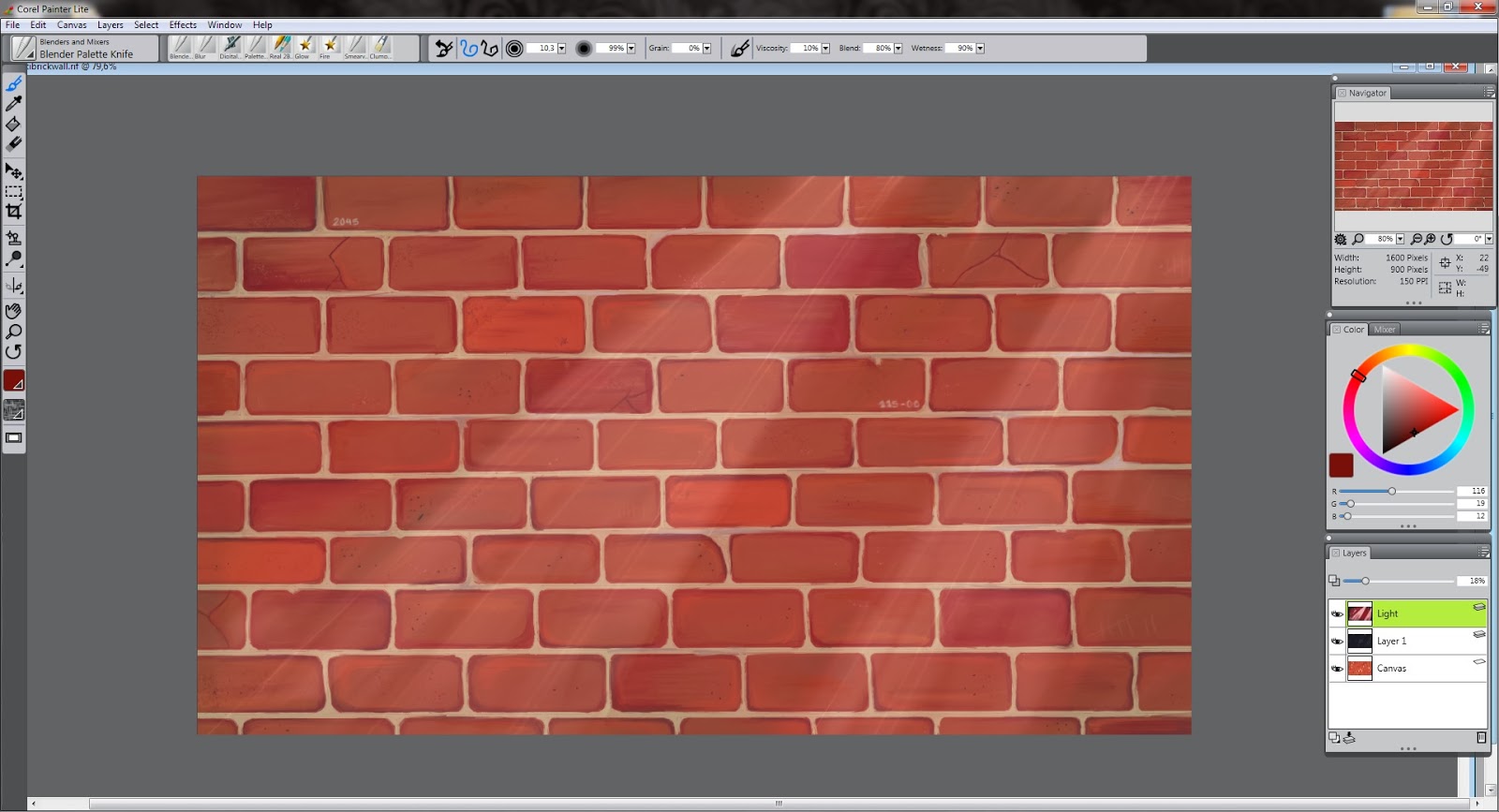
And after about two days of work, this is the outcome. Not too detailed but enough to get the picture. Anyway, it is the background and shouldn't draw too much attention from the actual piece.

After finishing the ground work on the piece, I felt as though it needed a certain 'notorious' feeling, so I added a layer of black on top of the brick wall with a capacity of 16% just to darken the picture a hint. After doing this I got a great idea that maybe the picture should have a few light spells that would highlight the graffiti that was to come and give another dimension to the picture, another thing I would never be able to do on my regular pieces on canvas. This layer I had on opacity of 18%, basically just going by feel not consistent numbers. I also added in some red in with the 'light' layer to add some character. 

Even though I had just added a layer of darkness and a few light spells, I still didn't feel like it did the trick and the picture still didn't feel quite enough notorious. So, I just duplicated the layer and added some lighter lines on to the spells so that the would pop up and seem more realistic as opposed to the previous one. 


 Now that is more like it! I can feel the darkness and haze falling upon the brick wall and the light spells giving some dimension to the picture as a whole. 

After being satisfied with the outcome of the background, I opened a new sheet and started planning my graffiti that I'll implement onto the brick wall and the outcome was something like this. I still find it difficult to draw with the pencils, because of the tilt function on the pen which easily makes the marks too fat and in order to keep the tip small, you have to keep the pen at a 90 degree angle. This I find quite challenging, but I guess you get used to it or then I will just have to find some other brush to work with. In order to make the drawing process on a white sheet easier on the eyes, I set the color of the paper to a light shade of grey. It helps a lot, especially if you are working on it for long periods of time.. 


 Being finished with my original sketch, I had to get this on my brick wall and start drawing the outlines. This is where I ran into complications and wasted a lot of my time trying to figure it out. Turns out that after outlining our graffiti onto the background, there is no way to re-size it. I needed this because I had made my graffiti too small for my taste and I wanted to enlarge it just by a little bit and I could not find a way to do this. Oh well, after about 2 hours I managed to get my outline onto the picture, and below is the outcome.

 And here we go, this is the point that I am at now ready to start with my color scheme. Not too much trouble, but enough to make me frustrated enough to lay off of the project for a while. 

Tune in next week for the final results...

Saturday, December 28, 2013

Post Christmas Madness

Happy happy holidays...

The passing week has been a busy one for everyone and I do apologize for not posting last Sunday, to make it up I decided to post a day early just for you guys. As anticipated, the Intuos Pro arrived, ah the beauty. The only problem is.. After finding out from an extremely stubborn German Intuos support person, my Intuos graphics tablet is not 'supported' by Adobe or Corel software- because I live in the middle of practically nowhere, you know, right next to Santa Clause's workshop -  and thus, I have to go buy a software myself and let me tell you, it is not cheap. However, I've managed to get me a trial version of Corel Painter Lite for about 15 days before I have to go buy it for 60 euros... Or just go ahead and buy the Corel Painter version which is valued at around 420 euros. Peanuts, huh? Anyway as you know, without the software the tablet is as useful as an over grown track pad.


 Anyways, here is the beauty. Just today I got to really try it after making the decision to download the Corel Painter Lite, as you can see my drawing on the computer screen which was doodled on the Painter Lite program with the graphics tablet. Even though my tablet is size small, it is quite enough for my purposes and I didn't find it too small, at least not yet. What I'm trying to say is that you don't necessarily need a great big pad for your first one, if it is your first one, the small size is plenty big. Actually it was a great deal bigger than I thought even though I had my doubts about it. With the keyboard, I hear you can speed up your selections and working, but I sure haven't gotten used to any of it quite yet. I had this imagine in my head before I got to drawing that it would be unbearably odd to draw looking at a screen while sketching on a tablet below your nose and I had a pleasant surprise discovering that this wasn't the case. After about 10 minutes of doodling I quickly got used to the setup and found it slightly weird but nothing that I couldn't get used to in a few days of practice. There is a cool rotation function, as if you were actually tilting the paper to draw more naturally, which is a great help to make the procedure feel like you are actually drawing on a piece of paper.

 Along with the graphics tablet, I got a few books to get me started and familiar with the functions of the software and machine. Unfortunately, most of these are focused on Photoshop, which I'm not too keen in learning, for instance, using existing pictures etc to make art. I'm more of a 'do it yourself'' kind of person, and I sometimes find it more as cheating than making art which I know, I know, isn't true. Anyway, I've been through all of these books, and they are great for learning and getting used to the software with a few inspiring ideas and tips for the future. I've got a lot to read and learn...


 This book I have been especially enjoying, "Digital Revolution: Creating Fine Art With Photoshop" by Scott Ligon. This book contains some kinds of exercises if you ever feel like inspiration just isn't striking and you feel like learning something new. Scott Ligon also talks about the significance of Digital Art and its place in the art world, which is pretty cool in my opinion. Just to clarify, Photoshop isn't just about pictures and altering them, you can also start from scratch and work from there, maybe using other pictures just to gain reference.


After sketching around with the Painter Lite for a few hours, I tested my skills by drawing out of my own memory and drew this pumpkin in a bit less than an hour. It took me awhile, but I really did think that my first doodle would have gone a lot, I mean a LOT, worse.


So I guess all in all, I'm relatively pleased with this digital art thing. On the pumpkin I first created a layer and drew my sketch with a "2B" pencil, I gotta say it took me awhile to get used to the tilt- function on it, if you wanted a thin pencil mark, you have to keep the pencil at a 90 degrees angle and on a 45 degrees if you wanted a fat, rich mark. So that was one of the obstacles with the Painter but otherwise the experience was pretty authentic. For the colors I used "Bristle Oils" and to blend the colors I used a "Blender Palette Knife". Now, this is my first time using Bristle Oils so I can't say whether it felt realistic or not, but I think it looks pretty real, like paint on a canvas. Yes? No?

Anyway, that's about it for Christmas and today. Now, excuse moi, I've got to get back to my 15-day experience of doodling..

Sunday, December 15, 2013

Artist's Block

Hey ya's,

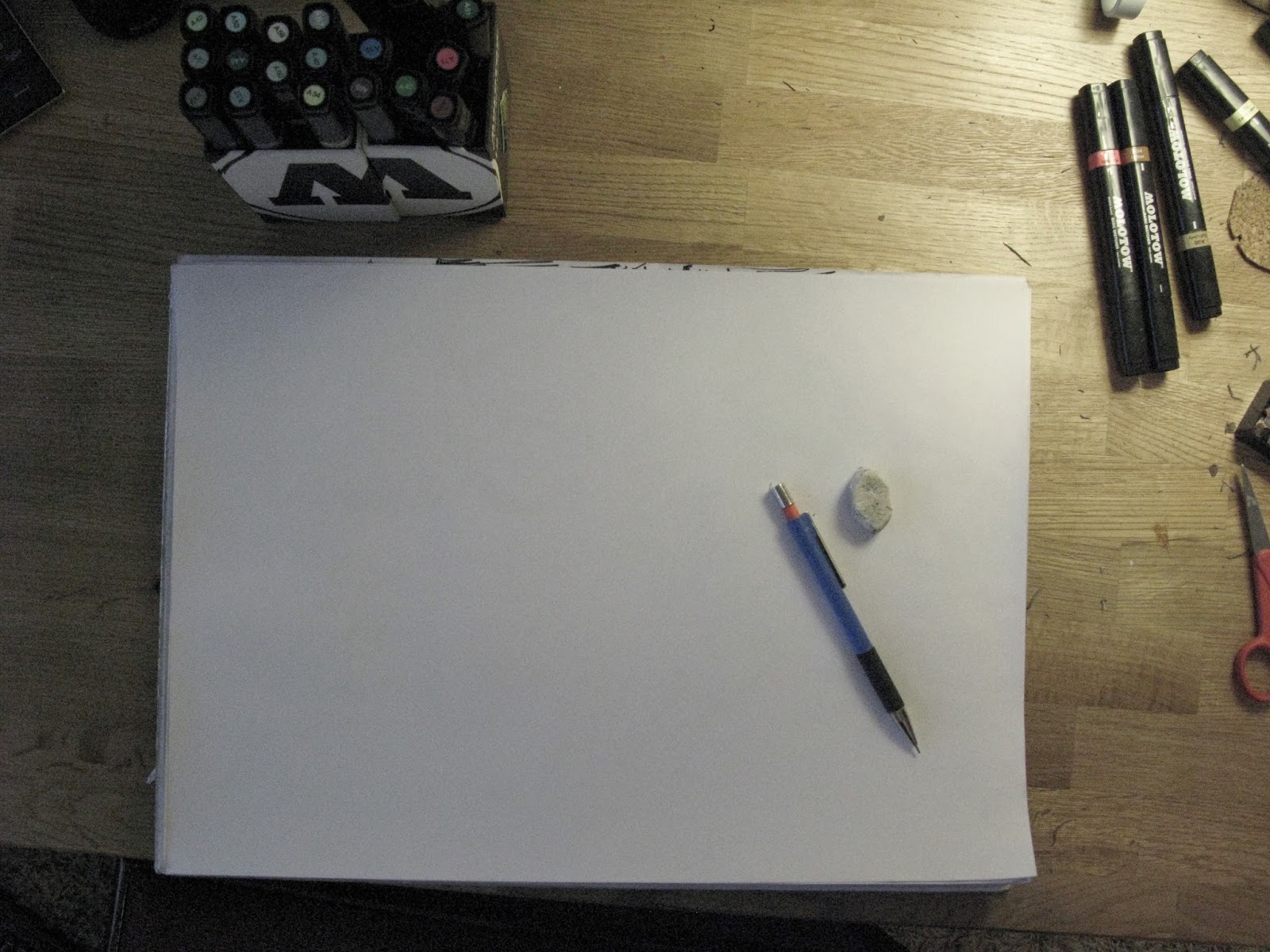
    Christmas is coming and I've been feeling in a real holiday mood and ready to draw everything and anything this weekend and I actually reserved the entire weekend just for drawing and getting new ideas rolling and what happens.. Of course I get 'artist's block', just perfect. For instance today, I was staring at a blank piece of paper for about two hours, tried to doodle something once or twice and ended up destroying my entire eraser on it. After getting too frustrated and tired, I get up and I'm covered with bits and pieces of my used up eraser and I think to myself - oh, what a lovely day. This happens to me well, maybe every few months which is when I just feel like throwing out all my works and giving up on the whole idea of being an artist or whatever it is that I am going to be. It  is a mix of shame, underachievement and misery and I've got to thank my lucky stars this devil doesn't come around too often.

So this is what I've been staring at for the past 2-3 hours, and in fact, it is still sitting on my desk just like this waiting to be filled with color and excitement. Maybe tomorrow, maybe...
    Certainly a bad weekend, even the shoes I was supposed to have finished by the 17th of December, which I talked about in my last post, can't be finished before the deadline and I do really feel awful about letting down my first customer. The problem being that it is indeed winter time in Finland and almost impossible to find summer shoes in the local shops for a guy going to Africa for his winter holiday. So, about two weeks too late, I couldn't order shoes on time before my customer leaves on holiday and thus, I had to let him down a few days ago. Lucky for me, he is still willing to buy my shoes and gave me an extra six months time to finish the shoes... Will I make it?!

    However, in my Christmas mood yesterday, I felt like drawing some new characters with a cute little Christmas theme. Adorable, right? Oh well, I used Molotow Basic Sketchers for this doodle and that was about all of what I did from Friday until today, Sunday afternoon.

 
   To be brutally honest, I don't appreciate the picture much, I feel like I'm going towards a more nature-oriented and perhaps a more retro path, with simplistic ideas and figures. Not saying that this isn't simplistic, it sure is but I wan't to give more impact with my art than just an elf and a reindeer hanging around. Unfortunately, I was trying to go that way today and I just could not find a way to express my ideas onto a paper in a presentable way so I guess I will have to lay off it for a day or two.

  On the picture above, I thought the Molotow Basics wouldn't give me enough of a variety of colors to work with, so I started with my good old pencil box which I can always rely on. I never was much of a pencil person, but it seemed like a better option than just leaving the picture black and white. This box has everything I need: crayons, water colors, pencils of all colors and sand paper just in case. Too bad I'm not into any water colors or crayons as you can see, all of them are practically untouched..


   Just to get off the subject of my art for a moment, if you guys didn't really read about art or perhaps read at all, I thought I would enthuse a bit about doing so. As you know, I'm getting into digital art in the near future so I've been reading this magazine called Digital Artist which is actually great for getting tips how to add effects to your work on Photoshop or how to get your art piece to pop out and give that desired 'wow' factor.


    So you guys know, my goal here isn't to advertise or get you to buy this magazine or anything like that but in fact, it is to show that if you feel like you're not getting any good ideas or you're not quite sure how to get a desired effect on your piece, there are ways to gain inspiration other than your precious mind. Sometimes you do need to borrow a book or look into magazines or TV shows about art. I've been watching a show on old art in the Netherlands and believe it or not, there is some interesting stuff out there other than street art. I can't believe I'm saying because the last thing you should hear from me is that classical art is interesting but I swear, it is true. You just need to get past Van Gogh or Monnet, for me at least these 'great' artists from the older periods have always turned me off to classical art. Wow, I really went off track didn't I..
    Anyways to conclude, my point here was that for me, I found lots of great tips from this magazine and apps that I can get on my tablet and start doodling away. Especially for days like I'm having right now when I feel like quitting on art, it's a great time to catch up on reading and maybe pick up some tips on the way.

Sunday, December 8, 2013

Companies and Customers

He-ya folks,

This week I haven't gotten any projects rolling on yet, but I did get my 'company' rolling on this week, obtaining my first customer (ahem, NOT a friend...) and today I've been working on a design for a custom pair of shoes. Also, because me and my friend started a company of our own called TP Productions, I've been busy working on that and coming up with a sufficient logo for it. Can you guess what it's going to be? Yes, you name it, a Ti-pi. I think that the logo going to be pretty cool if we ever finish it and make it simple enough to fit as a logo for our new 'shoe' company. Maybe someday...We are planning on setting up a site so that we can get some brand awareness and get a start to this company before we get too busy with other projects. However, with my new customer I haven't got much time to hash it out; I've got about a week to design, order and finish the entire pair of shoes. Phew. 

Alright, to begin with my custom made shoes. First I have to get the shoes which will look about like the one in the picture below, a simple (black) canvas shoe if you will.

The design I went about today was this;  "Nupy" on the right shoe and "Lee" on the left. However, this is not going to be in my designs list in which you can choose your design IF and only if you are willing to be our potential customer. This is a requested design which I had already made oh, about a year ago to my customer which he wishes to have on his shoes as an updated version. This of course makes me very happy that he still likes my design.. The picture above is of course just a 15 minute sketch on what I'm actually going to do, I needed to do this to get a rough idea on what I am actually going to do. I'm not keen on planning my works, I like to do them on the fly and see what happens. Hence, I'd imagine it will look quite different from...that... before it's the finished product. 
Moving forward, I'm going to use the Molotow One4Alls again for this job, since I don't have a hot press to get the design onto the shoe easily because those things are as you know - expensive as hell. Maybe when I get filthy rich and famous (ha ha). That is about it on the shoe front, I am ready to roll onto the next topic. 

As for also today, I've been working on our company logo and talking through our set up with my associate on what to do with our business idea. And here you go, a rough idea of our starting logo for TP Productions. It really did start as a joke between the two of us, because our initials put together it sounds like a ti-pi so our logo should be that too. What do you know, it works! Hopefully on the shoe too, we haven't tested that quite yet. I wanted to make the logo a LOOT more complex, but turns out it has to be as simple as possible to stick in the customers' minds as long as it can, like a brain tumor or.. something. What can I say, I hate doing simple things like readable letters or dull, simple drawings. My motto stands, the more detail the better. Anyways, we've got to get this baby on the computer to get further processed and make a business card as soon as possible to get rolling, the only problem being that we want to make our own design with the business card and the logo. We feel like scanning just doesn't seem like the right solution to give out a good impression from our work.

And what is my solution, you may ask? Ah yes, I've got one my friends: A graphics tablet. I sure do know what I want from good old Santa Clause! 
It's a beauty, isn't it? This magnificent thing is a table which you hook up to your computer and Voila! Draw away. This has been my dream for a few months now, I think it will revolutionize my drawing and I will be able to get to actually designing and doing what I will probably be doing in the future with any luck. With the help of this baby, our business card and logo will be child's play! The particular one right there above is made by a company called Wacom and the brand name is Intuos Pro S, going at the rate of about 250 dollars. It is indeed quite expensive for just a tablet for drawing, but I do believe it is the step in the right direction for an aspiring commercial artist. Hopefully it will pay off sooner or later. 

Oh well, that is all for this week and next week we shall see the results of my productive week that is coming up. Be sure to stay tuned until then, sayonara peeps!

Sunday, December 1, 2013

The Hippie Project - Finished

Top o' the month to yas!

   I am back! Phew, one rough test week over... I've had some extra time to kill, so finally I actually got something done, which is indeed my latest project. However, before presenting you guys the final work, I want to show something.. For the past ten weeks, I've been in this black and white themed art class basically just to improve on my still-life drawing skills so that one day I can make it to a good arts college - hopefully.
    I got about 4 pieces started, but this was the only one I finished and which I thought was worth showing. My first work with charcoal AND on an easel. Looks different from my other works huh? It was a shock to me too. Basically this was just an exercise on contrasts and selective detail which I found quite intriguing. On top of all this, I was working a huge surface, very difficult for me as a beginner in a traditional art sense. Anyways, this castle will go into my portfolio until something better comes up and saves the day.


    Alright, now that I am done with my castle, we can get to the good stuff. This is what I started with yesterday evening. I had to spray more white onto the canvas again, I didn't feel like the picture wasn't really coming together quite yet, frankly I still don't believe they do. 


     It has to be said, the eagle was a tough one. This is the first time I'm drawing a bird let alone an eagle. I found the feathers the most difficult to do and I found out too late that I couldn't find good shades of brown for the feathers and my extra fine white marker was acting up, creating a mess all over the canvas. What can I say, I gave it my best shot anyway.

    After spraying more clouds on the canvas, I still felt that the picture was just not coming together like I wanted it to, so I decided to add some cloud action wrapping around the letters and the totem pole, hoping that would do the trick.


    I guess it did help a bit, not too much though. At this point I got heavily frustrated and brought the blue spray can into action and limited the cloud action around the totem pole. I can't say I'm too happy with the result, maybe the reason to my problems is that it has taken me too long to finish it and I just lost my 'mojo'. Anyways, I managed to finish the graffiti part last night, which was a relief.

     I've been mulling about with the totem pole for ages, I just cannot find away to blend it into the picture. Clouds, fades, shadows; it just won't work. I may have gone wrong with setting the REZ too close to it, putting the whole picture out of balance.


    Here's the finished eagle. This bugger I finished today during the afternoon. The feathers were difficult to implement in, so i just thought I wouldn't put too much effort into details, just make it somewhat 'feathery'. 


And voila! I present to you, the finished canvas as a whole - I do apologize about the lighting, I was too late to catch the natural sunlight as in the morning.  

All in all, I am glad to see this project going into the archive and not to be further tampered. From this point onwards, it is only for you to decide whether it works or if it doesn't, I'm just looking forward to moving on to the next project. Got to start mulling about on that one...