Sunday, December 15, 2013

Artist's Block

Hey ya's,

    Christmas is coming and I've been feeling in a real holiday mood and ready to draw everything and anything this weekend and I actually reserved the entire weekend just for drawing and getting new ideas rolling and what happens.. Of course I get 'artist's block', just perfect. For instance today, I was staring at a blank piece of paper for about two hours, tried to doodle something once or twice and ended up destroying my entire eraser on it. After getting too frustrated and tired, I get up and I'm covered with bits and pieces of my used up eraser and I think to myself - oh, what a lovely day. This happens to me well, maybe every few months which is when I just feel like throwing out all my works and giving up on the whole idea of being an artist or whatever it is that I am going to be. It  is a mix of shame, underachievement and misery and I've got to thank my lucky stars this devil doesn't come around too often.

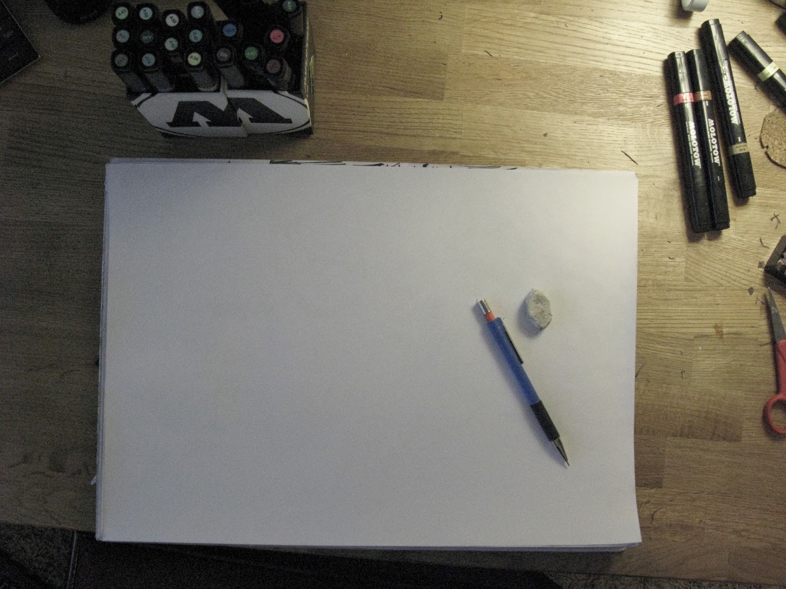
So this is what I've been staring at for the past 2-3 hours, and in fact, it is still sitting on my desk just like this waiting to be filled with color and excitement. Maybe tomorrow, maybe...
    Certainly a bad weekend, even the shoes I was supposed to have finished by the 17th of December, which I talked about in my last post, can't be finished before the deadline and I do really feel awful about letting down my first customer. The problem being that it is indeed winter time in Finland and almost impossible to find summer shoes in the local shops for a guy going to Africa for his winter holiday. So, about two weeks too late, I couldn't order shoes on time before my customer leaves on holiday and thus, I had to let him down a few days ago. Lucky for me, he is still willing to buy my shoes and gave me an extra six months time to finish the shoes... Will I make it?!

    However, in my Christmas mood yesterday, I felt like drawing some new characters with a cute little Christmas theme. Adorable, right? Oh well, I used Molotow Basic Sketchers for this doodle and that was about all of what I did from Friday until today, Sunday afternoon.

 
   To be brutally honest, I don't appreciate the picture much, I feel like I'm going towards a more nature-oriented and perhaps a more retro path, with simplistic ideas and figures. Not saying that this isn't simplistic, it sure is but I wan't to give more impact with my art than just an elf and a reindeer hanging around. Unfortunately, I was trying to go that way today and I just could not find a way to express my ideas onto a paper in a presentable way so I guess I will have to lay off it for a day or two.

  On the picture above, I thought the Molotow Basics wouldn't give me enough of a variety of colors to work with, so I started with my good old pencil box which I can always rely on. I never was much of a pencil person, but it seemed like a better option than just leaving the picture black and white. This box has everything I need: crayons, water colors, pencils of all colors and sand paper just in case. Too bad I'm not into any water colors or crayons as you can see, all of them are practically untouched..


   Just to get off the subject of my art for a moment, if you guys didn't really read about art or perhaps read at all, I thought I would enthuse a bit about doing so. As you know, I'm getting into digital art in the near future so I've been reading this magazine called Digital Artist which is actually great for getting tips how to add effects to your work on Photoshop or how to get your art piece to pop out and give that desired 'wow' factor.


    So you guys know, my goal here isn't to advertise or get you to buy this magazine or anything like that but in fact, it is to show that if you feel like you're not getting any good ideas or you're not quite sure how to get a desired effect on your piece, there are ways to gain inspiration other than your precious mind. Sometimes you do need to borrow a book or look into magazines or TV shows about art. I've been watching a show on old art in the Netherlands and believe it or not, there is some interesting stuff out there other than street art. I can't believe I'm saying because the last thing you should hear from me is that classical art is interesting but I swear, it is true. You just need to get past Van Gogh or Monnet, for me at least these 'great' artists from the older periods have always turned me off to classical art. Wow, I really went off track didn't I..
    Anyways to conclude, my point here was that for me, I found lots of great tips from this magazine and apps that I can get on my tablet and start doodling away. Especially for days like I'm having right now when I feel like quitting on art, it's a great time to catch up on reading and maybe pick up some tips on the way.

Sunday, December 8, 2013

Companies and Customers

He-ya folks,

This week I haven't gotten any projects rolling on yet, but I did get my 'company' rolling on this week, obtaining my first customer (ahem, NOT a friend...) and today I've been working on a design for a custom pair of shoes. Also, because me and my friend started a company of our own called TP Productions, I've been busy working on that and coming up with a sufficient logo for it. Can you guess what it's going to be? Yes, you name it, a Ti-pi. I think that the logo going to be pretty cool if we ever finish it and make it simple enough to fit as a logo for our new 'shoe' company. Maybe someday...We are planning on setting up a site so that we can get some brand awareness and get a start to this company before we get too busy with other projects. However, with my new customer I haven't got much time to hash it out; I've got about a week to design, order and finish the entire pair of shoes. Phew. 

Alright, to begin with my custom made shoes. First I have to get the shoes which will look about like the one in the picture below, a simple (black) canvas shoe if you will.

The design I went about today was this;  "Nupy" on the right shoe and "Lee" on the left. However, this is not going to be in my designs list in which you can choose your design IF and only if you are willing to be our potential customer. This is a requested design which I had already made oh, about a year ago to my customer which he wishes to have on his shoes as an updated version. This of course makes me very happy that he still likes my design.. The picture above is of course just a 15 minute sketch on what I'm actually going to do, I needed to do this to get a rough idea on what I am actually going to do. I'm not keen on planning my works, I like to do them on the fly and see what happens. Hence, I'd imagine it will look quite different from...that... before it's the finished product. 
Moving forward, I'm going to use the Molotow One4Alls again for this job, since I don't have a hot press to get the design onto the shoe easily because those things are as you know - expensive as hell. Maybe when I get filthy rich and famous (ha ha). That is about it on the shoe front, I am ready to roll onto the next topic. 

As for also today, I've been working on our company logo and talking through our set up with my associate on what to do with our business idea. And here you go, a rough idea of our starting logo for TP Productions. It really did start as a joke between the two of us, because our initials put together it sounds like a ti-pi so our logo should be that too. What do you know, it works! Hopefully on the shoe too, we haven't tested that quite yet. I wanted to make the logo a LOOT more complex, but turns out it has to be as simple as possible to stick in the customers' minds as long as it can, like a brain tumor or.. something. What can I say, I hate doing simple things like readable letters or dull, simple drawings. My motto stands, the more detail the better. Anyways, we've got to get this baby on the computer to get further processed and make a business card as soon as possible to get rolling, the only problem being that we want to make our own design with the business card and the logo. We feel like scanning just doesn't seem like the right solution to give out a good impression from our work.

And what is my solution, you may ask? Ah yes, I've got one my friends: A graphics tablet. I sure do know what I want from good old Santa Clause! 
It's a beauty, isn't it? This magnificent thing is a table which you hook up to your computer and Voila! Draw away. This has been my dream for a few months now, I think it will revolutionize my drawing and I will be able to get to actually designing and doing what I will probably be doing in the future with any luck. With the help of this baby, our business card and logo will be child's play! The particular one right there above is made by a company called Wacom and the brand name is Intuos Pro S, going at the rate of about 250 dollars. It is indeed quite expensive for just a tablet for drawing, but I do believe it is the step in the right direction for an aspiring commercial artist. Hopefully it will pay off sooner or later. 

Oh well, that is all for this week and next week we shall see the results of my productive week that is coming up. Be sure to stay tuned until then, sayonara peeps!

Sunday, December 1, 2013

The Hippie Project - Finished

Top o' the month to yas!

   I am back! Phew, one rough test week over... I've had some extra time to kill, so finally I actually got something done, which is indeed my latest project. However, before presenting you guys the final work, I want to show something.. For the past ten weeks, I've been in this black and white themed art class basically just to improve on my still-life drawing skills so that one day I can make it to a good arts college - hopefully.
    I got about 4 pieces started, but this was the only one I finished and which I thought was worth showing. My first work with charcoal AND on an easel. Looks different from my other works huh? It was a shock to me too. Basically this was just an exercise on contrasts and selective detail which I found quite intriguing. On top of all this, I was working a huge surface, very difficult for me as a beginner in a traditional art sense. Anyways, this castle will go into my portfolio until something better comes up and saves the day.


    Alright, now that I am done with my castle, we can get to the good stuff. This is what I started with yesterday evening. I had to spray more white onto the canvas again, I didn't feel like the picture wasn't really coming together quite yet, frankly I still don't believe they do. 


     It has to be said, the eagle was a tough one. This is the first time I'm drawing a bird let alone an eagle. I found the feathers the most difficult to do and I found out too late that I couldn't find good shades of brown for the feathers and my extra fine white marker was acting up, creating a mess all over the canvas. What can I say, I gave it my best shot anyway.

    After spraying more clouds on the canvas, I still felt that the picture was just not coming together like I wanted it to, so I decided to add some cloud action wrapping around the letters and the totem pole, hoping that would do the trick.


    I guess it did help a bit, not too much though. At this point I got heavily frustrated and brought the blue spray can into action and limited the cloud action around the totem pole. I can't say I'm too happy with the result, maybe the reason to my problems is that it has taken me too long to finish it and I just lost my 'mojo'. Anyways, I managed to finish the graffiti part last night, which was a relief.

     I've been mulling about with the totem pole for ages, I just cannot find away to blend it into the picture. Clouds, fades, shadows; it just won't work. I may have gone wrong with setting the REZ too close to it, putting the whole picture out of balance.


    Here's the finished eagle. This bugger I finished today during the afternoon. The feathers were difficult to implement in, so i just thought I wouldn't put too much effort into details, just make it somewhat 'feathery'. 


And voila! I present to you, the finished canvas as a whole - I do apologize about the lighting, I was too late to catch the natural sunlight as in the morning.  

All in all, I am glad to see this project going into the archive and not to be further tampered. From this point onwards, it is only for you to decide whether it works or if it doesn't, I'm just looking forward to moving on to the next project. Got to start mulling about on that one... 

Sunday, November 17, 2013

The Hippie Project - Take II

Hiya folks!

Top of the Sunday to ya's.. I have been extra busy this week with school work, for next week is an important week, well, you may not know but all us so-called 'Lukio' kids here in Finland are extremely aware of - the test-week. This is what all the Finnish kids in upper-secondary school dread every few months or so. Essentially it is seven days of brain wrecking tests, just tests. It is not fun I guarantee you. Anyways, enough about my school issues. I managed to fit a few hours of art in during this weekend and I used all those precious hours for my Native American Project. I am happy to say it is not a blue sky with two clouds anymore! I do have to admit, I've only used about 2-3 hours on the project this week, so everything is still pretty much a rough idea and I think it will change quite a bit by next week's post.

So this is were I was left off last Sunday.
A pretty little blue sky with a few clouds here and there bringing the mood up, now of course I wished I would've made the whites darker and more wide spread because I used more space for my graffiti part than what I had estimated but hey, it's fixable. I will just have to doctor it up a bit with the spray again in the end and it will turn out just fine. Hopefully. I forgot to take pictures from when I sketched the whole picture on, but basically I just use a neon yellow marker for that part, as you can see in the picture below with the eagle.

Aaand this is what I started with this morning. As you can see, I had just gotten started with the graffiti and the totem pole is poorly done. A lot has got to be done! I got sick of the totem pole yesterday and today I just wanted to do something else so I started coloring in the letters REZ.


I got this great idea a few days ago to make the letters as they were planks of wood which, don't mind me saying, looks pretty good against the blue sky and gives a cool texture to the whole canvas. I figured that the whole shebang can't be one big plank of wood so I thought what better hippie/hipster color than burgundy. Tacky, I know! What can I do, it does fit into the color scheme. After coloring in the letters and giving them the wood texture, I started thinking about the shadows and I still cannot think about a good color to fit the theme. Black would work but it is just too boring and I feel like I have over-used it for awhile now.

 Concerning the totem pole, I have this doubt in my mind that it will not blend with the letters and I have to figure out a way to buddy them up. I might add in some clouds to sort of haze them together, maybe that will do the job. I just love the wings on totem poles, and I wanted to give mine a bit of a hippie twist on it, hence the squares and patterns. The original version had a simple triangle on it, I just felt like it would not do it for me this time. After working on the totem pole for about two evenings, I felt like I had personalized it too much, and it didn't feel so real anymore so I had to go back to the picture and get more influence out of it. I didn't change the wings but everything else had a minor makeover. The pictures below don't have such great lighting because it's getting dark so my apologies. I had to naturalize the totem pole a bit after looking at the original picture and I do believe it is blending in better now, especially looking at the pictures now. Could be the lighting though, I am not quite sure yet.

Alright, enough about totems. Here we go, the REZ. Sorry about the lighting again in the pictures, November evenings are a bitch... But yes, I really do like the texture in this piece. The colors really seem to blend in, I haven't tried the mix before and this one just came with instinct. I barely even knew I had a burgundy-colored marker. Oops. The only thing missing is the cloud action I wanted in the background, but I shall fix it later. This piece is great in that I could let my hippie character out and I didn't have to listen to Matlock, 2Pac or Outkast to get into the graffiti-mood, which I usually have to. Not saying it's a bad thing or anything, just a nice change.


Here's a bit more on the texture, can you feeeeel the softness?! Oh right, the shadows. I'm still wondering about that one. Ideally, I will have a nice little light bulb moment which will give me just the right answer I was waiting for. We'll see...


Aaand, this is where I am now. I am seriously dreading on starting the eagle, drawing birds was never my strongest quality. However, I have got to start someday - leaving it like this will just drive me crazy sooner or later. I really did I would have this piece finished by now, don't blame me blame IB. Next week I may not be able to post anything because I have tests all week so it could very well that the next time I'll be here it's going to be.... THE FIRST OF DECEMBER! Which is also when you can officially start listening to Christmas music and start your shopping sprees in jolly spirits.

That is all for now, the T is signing off.

Sunday, November 10, 2013

The Hippie-Project

Hey-ya people!

  What is up?! Alright, this weekend I have been busy with a lot of things, but mainly with the fairly new hippie-native project - I really should come up with a sufficient name for it but hey, I got better things to do with my time. I've only finished the background today since it's been a rainy, cold, windy, sunny... Eh, frankly I'm not sure, the weather just cannot make it's mind up today in good old Finland. That's November for ya. However, I have to wait forever for the canvas to dry enough so that I can work on it. Actually, I just finished right now and the piece is sitting outside on the balcony all alone waiting for my magic touch. Maybe, just  maybe in a few hours I'll be able to work on it, but you guys will just have to wait 'till next week, my apologies. Today's key word will be patience, patience, patience... 

   So, today I started early in the afternoon by building my canvas from S-C-R-A-T-C-H, not an easy job for one person. Long story short, I had to get some help for the stretching and stapling. My canvas frames may not be the most beautiful ones you have ever seen but I can say from experience that it is a sensational feeling when you look at your finished canvas knowing that you have made the entire thing with your own two hands. Really. 

Anyways, to refresh your mind, here is my original plan for the canvas:

And to begin with the real deal, I start with my canvas roll, figure out the dimension for my work and add about 8cm to the original dimensions, so that I have enough canvas to wrap around the wood pieces.


 My piece came out to be 55x40cm (63x48 with the extra). Make sure that your canvas piece is squared, wobbly lines will not work. Exact measures and straight lines are key to building a canvas. I may not be the best person to tell you how to build a canvas, frankly I haven't googled it or anything but you are welcome to tell me what I am really supposed to do, I just use the good old common sense.  


Now, I have cut four pieces of wood for myself, all ready to be glued and stapled together. I've got 2 x 55 cm and 2 x 40 cm wood blocks to do the job. After finishing the frame, I usually let it sit for a few hours and keep myself busy with one thing or another. When the glue is dry, I make sure the dimensions work with my canvas before cutting it out from the roll. Then I just stretch the canvas onto the frame and staple it together and ta-da! A finished canvas ready for some serious action. I make my way to the balcony and start working.  

 Here we go, at the balcony and ready to rumble, a piece of cardboard under the canvas so that I don't ruin the floor with some pretty colors. 
My color-scheme is quite simple this time, I don't want to draw too much attention to the background, so it will just be a blue sky with some hazy white clouds, I might throw in some purple or a darker blue to bring out some depth.


   As I said, it is all about simple colors. A background that has a certain calmness to it, the blue color isn't as dark as it is in the picture for it was quite dark outside and the inside light just won't do this time. I did add some purple, but I faded it out just enough to just have a little glimpse of it here and there.
   You can see that the canvas is a bit wrinkled, the stretching doesn't always come out perfect but hey, I'm looking at it right now and honestly, I cannot see a wrinkle and it looks just like the 'better' one you buy from the shop next store. What can I say, I'm satisfied.


Alright, now that we are done with the background, I wanted to let you in on my color-schemes for the actual 'fine' work. I usually change them around during the process, but I can give a vague main idea now.

I've been doodling these totem poles all last week, thinking of the perfect one for my canvas, and I'm down to two. I like the one on the left more, but the one on the right is more traditional to the picture that I showed ya's last week. Oh well, I will figure it out at some point. However, the color scheme will be down to earth, as the whole piece will be. I want to preserve pretty much the same colors as on the original totem pole with, of course, a playful twist so that it will jump out of the canvas as it would against a clear, blue sky on a warm sunny day. Ah, I miss summer. 
As for the eagle, the basic colors will suffice. I'm sure I don't need to tell you what they are. I won't make the eagle as detailed as it is in the picture, so I won't have to go buy a wide range of different browns and yellows etc. I still want to keep the surreal feeling that graffiti has, which is the great beauty of it. 


The graffiti itself, "REZ", will be a natural mix of colors, I think I will go for a wood-like texture, that'll mingle with the eagle and the totem pole. The picture above gives a rough idea for what I am going for. 

And to conclude, this will be the all in all color-scheme. Quite a mix, huh. Right now I can't see them working but I guess we will have to see next week what went down. I don't want to speculate too much and ruin the fun of playing around with the colors and finding that golden mix that we all wish for. 

Phew, apparently I do have a lot to say, who'd a thought. Anyways, that is all for now, stay tuned at least 'till next week and you will witness the grand finish of my first-ever hippie canvas. I must say I do have a good feeling about this one. 

Sunday, November 3, 2013

Post-Halloween

Happy Late Halloween peeps!

This week I started on a new design for my next canvas, woo-hoo! I got some time for myself this weekend and I just went for it. My theme for this new canvas is a sort of Native American thing, with totem poles and eagles and maybe a nice Aztec graffiti in the middle. I started the graffiti part yesterday not knowing it would become anything like it is now. I was just doodling about a hippie-type graffiti...thing and just trying something new, but today I was looking at it and I just had this light bulb moment that hey, this thing HAS GOT TO have a totem pole next to it- and so I found my inspiration. And here it is:


As you can see, I haven't filled in the background yet like the graffiti, since I've just been sketching it for the past few hours and I realized that I was running out of time to write this weekly blog post. First I was going to plot the totem behind the letters, but I had some expert advice which got me to change my mind to just have it hanging there next to the letters. Since the totem was on the left, I needed something to balance out the piece and what could be better to keep company to my lonely totem than a big old eagle! It's a work in progress, I still have to tweak some minor aspects. 


 It's just the basic "REZ" again, I want to keep working it until I find perfection or until I just get bored to death by it. I haven't been using this for long, maybe for a few months now. I've tried to achieve this hippie, folksy look that would bring a good old retro feeling to this piece, just to balance out the last cold, metallic piece. I have trouble with drawing smooth lines and roundish letters, somehow I can't find a way to make them pretty. Other people do a great job with it, I just don't have the patience. I believe sharp lines and shapes are what make graffiti unique. I have included a few round shapes, to even out some sharp edges that needed softening. 
I couldn't remember what a totem pole looked like in real life, so I had to google it. I love these things: the faces, expressions, the detail - everything! The art that goes into it is just magnificent and beautiful, every totem has its own story. Anyways, I used this one as a model for my piece, I wanted something authentic, not just what I made up in my head, even though that would have probably been better. Maybe next time!

Here is the eagle that I am using as a guide. Mine will be a simplified version, of course. I think my background will also be a beautiful blue like this picture has, it won't take too much attention but it will bring out the other colors nicely - hopefully. 

After the planning, I have to start making my canvas which includes  a lot of measuring, sawing and gluing.  Next week I will be ready to go. Yey!


Oh and have you seen my artist's studio?

-The balcony.

It's cool, it's cool.. As you can see I've got no space and during the winter it really can be a pain. But for art I will suffer!


To conclude this weeks post, I want to leave you guys with this great line that has stuck to my head for good.


  Great right? I find this so true, even when I look at my very artistically talented and gifted friends, who find the smallest errors in their works and fall in to a funk because of it. A true artist will keep going until they find their perfection. It's truly like trying to find your inner peace or zen - almost impossible. Remember the 10,000 hours friends! Great artists aren't great because they were born great, they are great because of years and years of passion and practice. 

'Till next week then!